Why is the fixed footer not displaying correctly in my maze test?
Last updated: April 19, 2026
Figma is a powerful tool that allows you to create responsive designs, but since Maze allows you to test on devices with different screen sizes, you can run into trouble if your prototype isn’t designed to adjust to different screen heights.
If you have a fixed footer in your design that’s not appearing in your maz, or you notice that the footer is partially cut off, it’s possible you haven't pinned your footer correctly to the bottom of the design.
For instance, if you're designing for an iPhone 11 Pro with a resolution of 375x812 px and your fixed footer has ‘Constraint’ properties set to Left and Top, this means your footer will be fixed 812 px down from the top of the Frame. If your testers are using devices smaller than an iPhone 11 Pro, the footer will be located below the fold on their device, and will never appear even if the user scrolls down, since the position is fixed a distance from the top that is impossible to display on their device’s shorter screen.
Solution
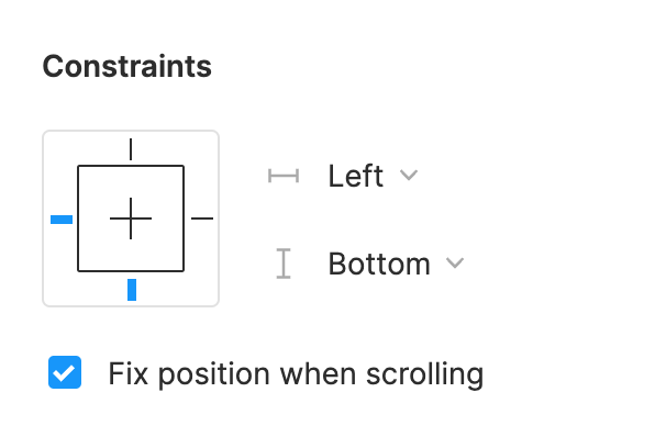
To avoid this, set the ‘Constraint’ properties to Left and Bottom and enable the Fix position when scrolling setting. This ensures that the footer remains fixed relative to the bottom of the screen.
You’ll also want to ensure that you’ve sized your frames to the shortest screen height you anticipate your testers using, and set an overflow behavior that allows scrolling. This guarantees the best tester experience regardless of the screen height.
Learn more about overflow behavior in the Figma Help Center
If you need to update these settings in an existing project, please update the ‘Constraint’ properties in Figma, then go back to your draft maze and click Refresh my prototype to reflect these updates.
If you've already sent your test live, it won’t be possible to refresh the prototype. In that case, please duplicate the test, make the necessary edits in Figma, then go back to the duplicated maze test and click Refresh my prototype to see these changes.
Still need help?
If you have any questions or concerns, please let our Support team know — we'll be happy to help!