Maze reports
Last updated: June 15, 2026
Maze reports make it easy to analyze and present your results data. They provide key metrics and analytics recorded with your study, so you can learn how your design performs at a glance, and share the learnings with your team. Reports can be used to plan your future sprints, and can be shared with stakeholders to align everyone on the next steps.
Reports are automatically generated for every live study tested with at least one tester. To get statistically significant data, we recommend testing with twenty users or more.
See this sample report for examples of what you can learn from your studies.
Where can I find the report?
Maze automatically creates a report for every live study tested by at least one user. To open the report:
Open your live study.
Click Report. Your report will open in a new tab.

The report provides key metrics for each block in your study. Every report gives a high-level overview of the study tested and also provides results for each mission and question.
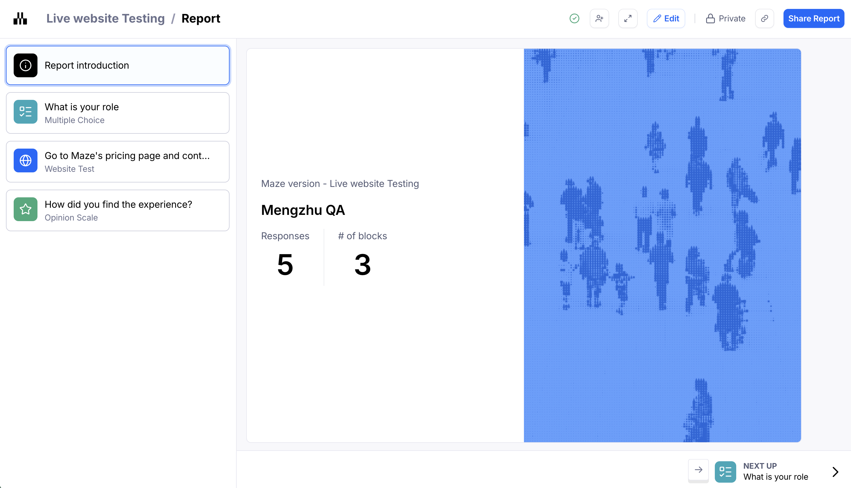
Report introduction
The report introduction gives you an overview of the study. It includes the number of responses and blocks in the study.
You can hide the usability score from the report introduction. Learn more
Usability score
The usability score measures your design's usability based on key performance indicators: success, duration, and misclicks.
A score from 0 to 100 is given to every study tested, as well as to each mission in the study, and each screen in the path(s).
These are the thresholds we use to measure the usability score:
High: 80 - 100
Medium: 50 - 80
Low: 0 - 50
Learn more about how the usability score is calculated
Mission analysis
In the report, each mission block is broken down into different sections for analysis:
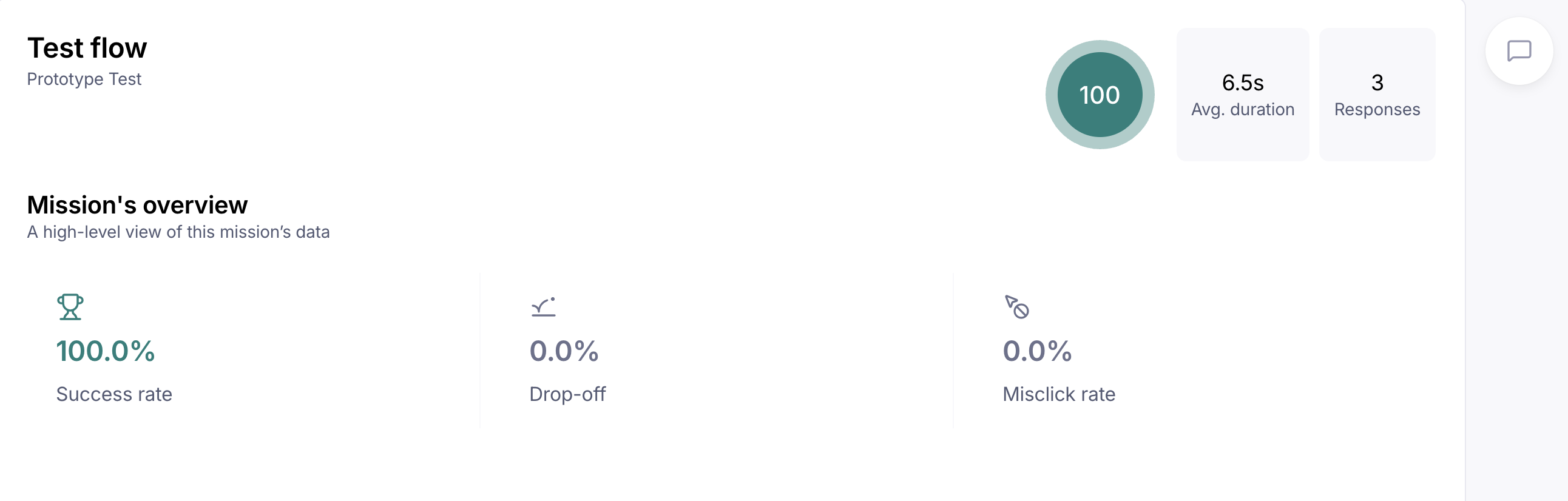
1. Usability metrics
In this first section, you'll see the following metrics:
Mission usability score: Evaluates that specific mission by calculating exit rate, misclick rate, and average duration
Direct success: Percentage of testers who completed the mission via an expected path
Mission unfinished: Percentage of testers who abandoned the mission, or ended it before reaching the final screen
Total testers: Number of testers who completed the mission
Misclick rate: Percentage of clicks outside a clickable area. In a live product, a misclick would have taken the user to an “incorrect” page.
Average duration: Average time each user took to complete the mission
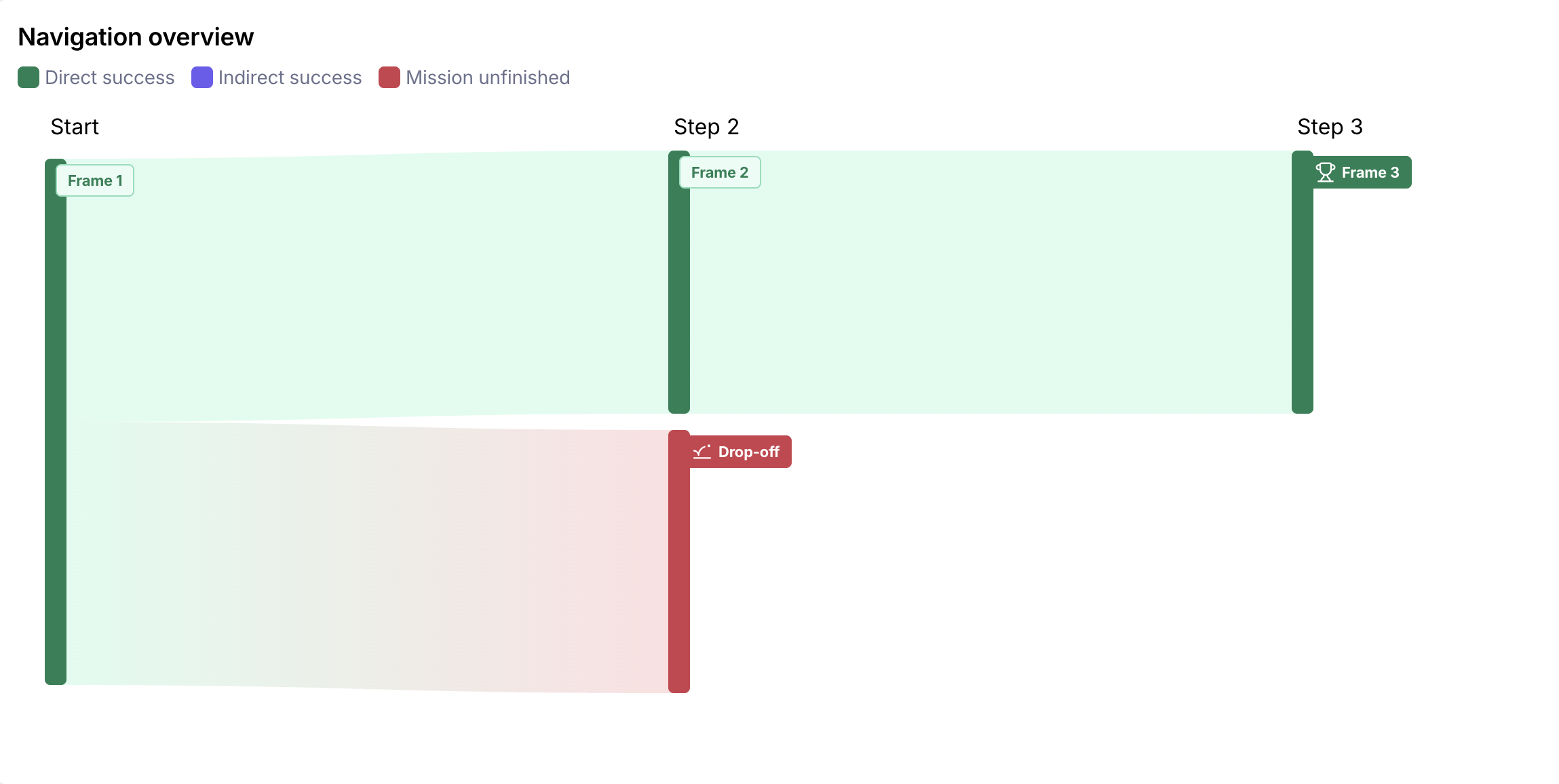
2. Navigation overview
This section gives you an overview of your expected paths, and how testers interacted with them. Click each frame to see more details for that specific screen on the full expected path analysis.
The report only shows the expected paths. If you have a very high success rate, you can rely on your report alone to understand your users' behavior. But if your study has a lower success rate, you'll likely need to use the raw data in the results dashboard to dig into any alternative indirect success paths your testers may have taken, as these will appear in the report as a drop-off.
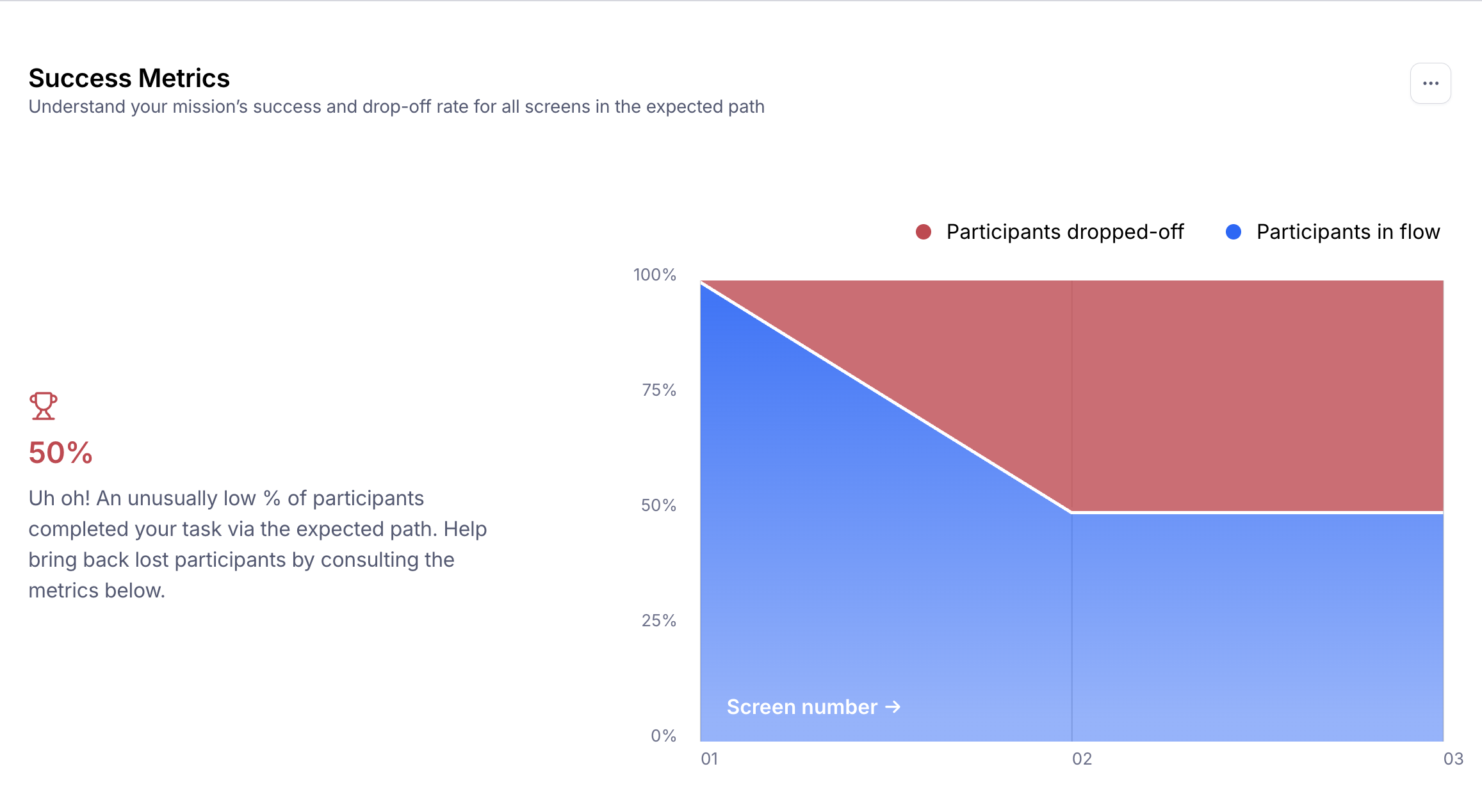
3. Success metrics
This section shows you how many people deviate from the expected path(s) you're set, and where on the flow that happens. A steep drop on a specific screen may indicate that the design or the setup of the test needs to be reviewed.
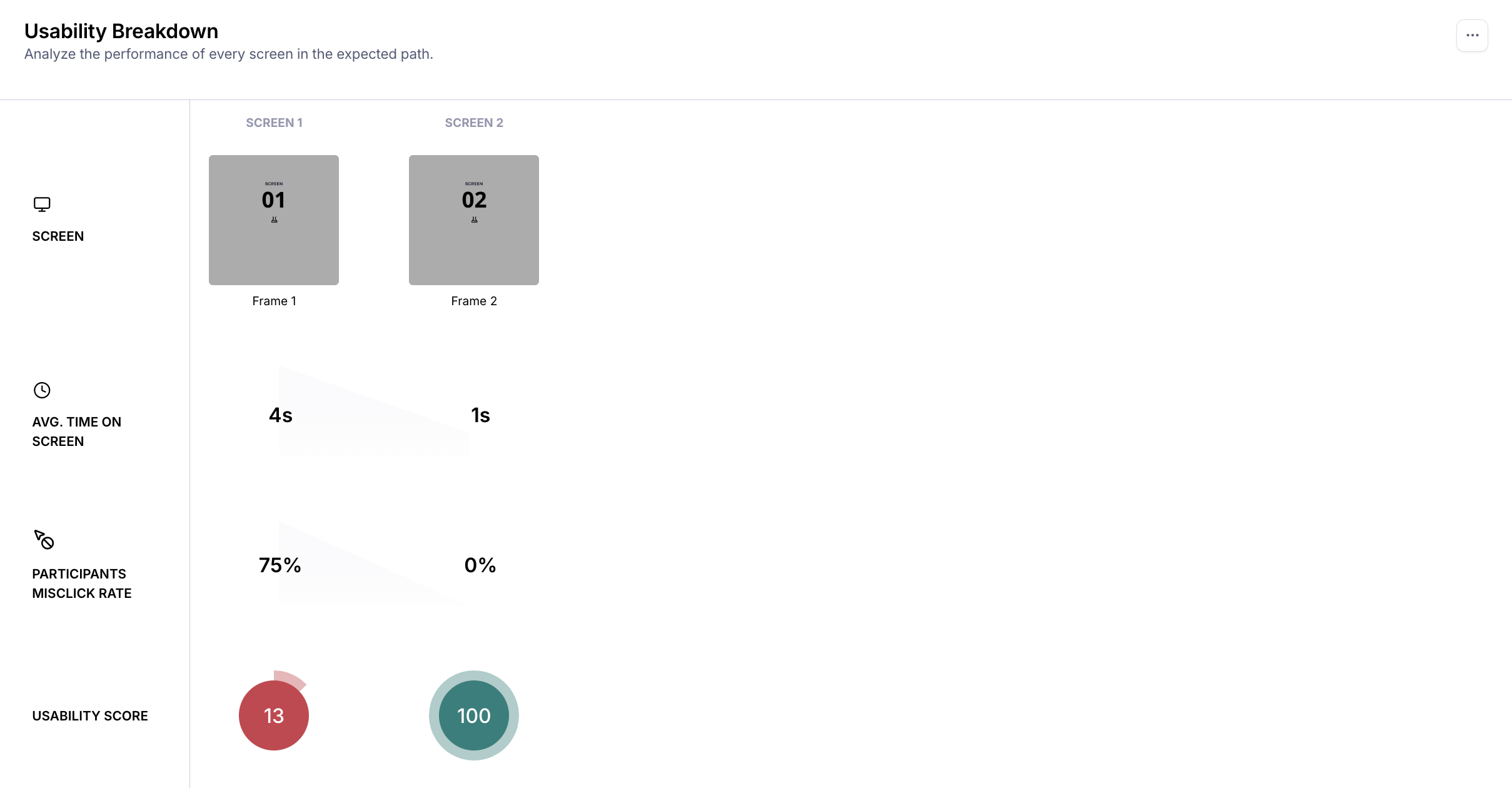
4. Usability breakdown
In this section, you'll find a detailed examination of every screen's usability with the average time spent, misclick rate, and usability score for each screen.
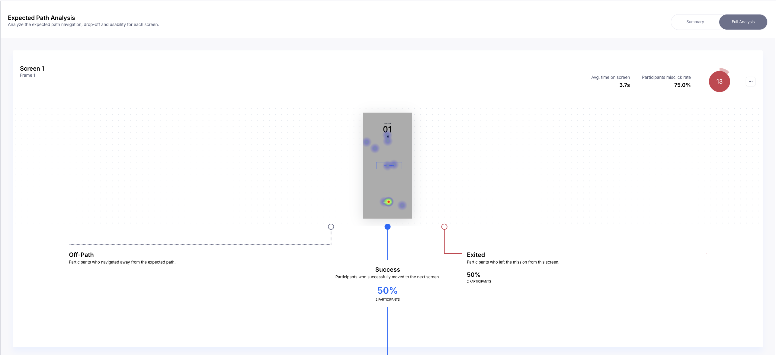
5. Expected path analysis
Toggle the Summary portion of the expected path analysis to group your screens by performance:
Screens to rework: Low usability score (0-50)
Screens to check: Medium usability score (50-80)
Great screens: High usability score (80-100)
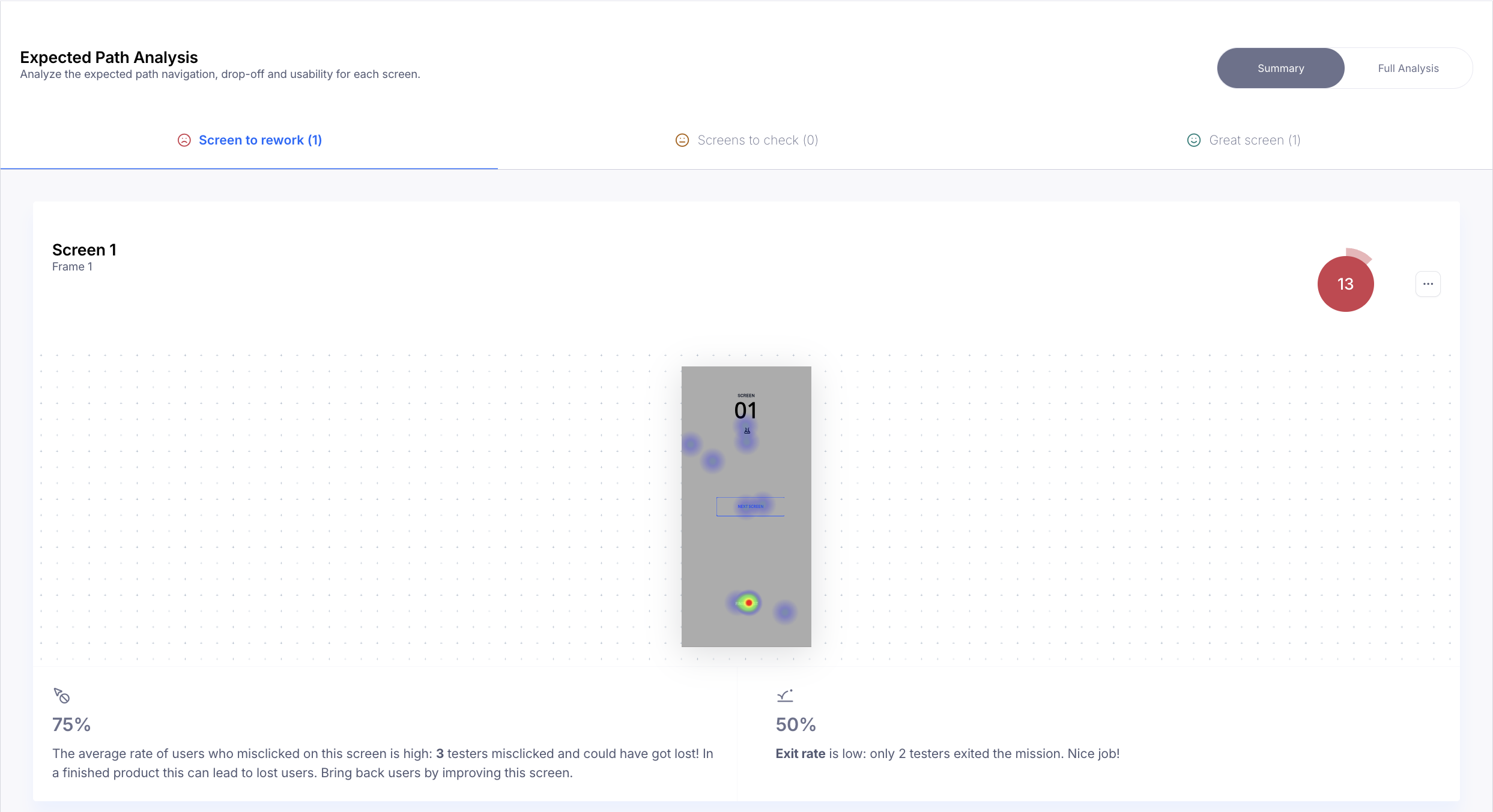
Click Full Analysis and scroll through the screens to dive deeper into the interactions with each screen, and whether they resulted in testers going off the expected path, moving to the next expected screen, or abandoning/stopping the mission.
Remember that the report only shows the expected paths. If your study has a higher success rate, you probably can rely on your report alone to understand your users' behavior. However, if the study had a lower success rate, you'll likely also need to use the raw data in the results dashboard in tandem to dig into alternative indirect success paths, as the report will simply show these testers going off-path.
Website test analysis
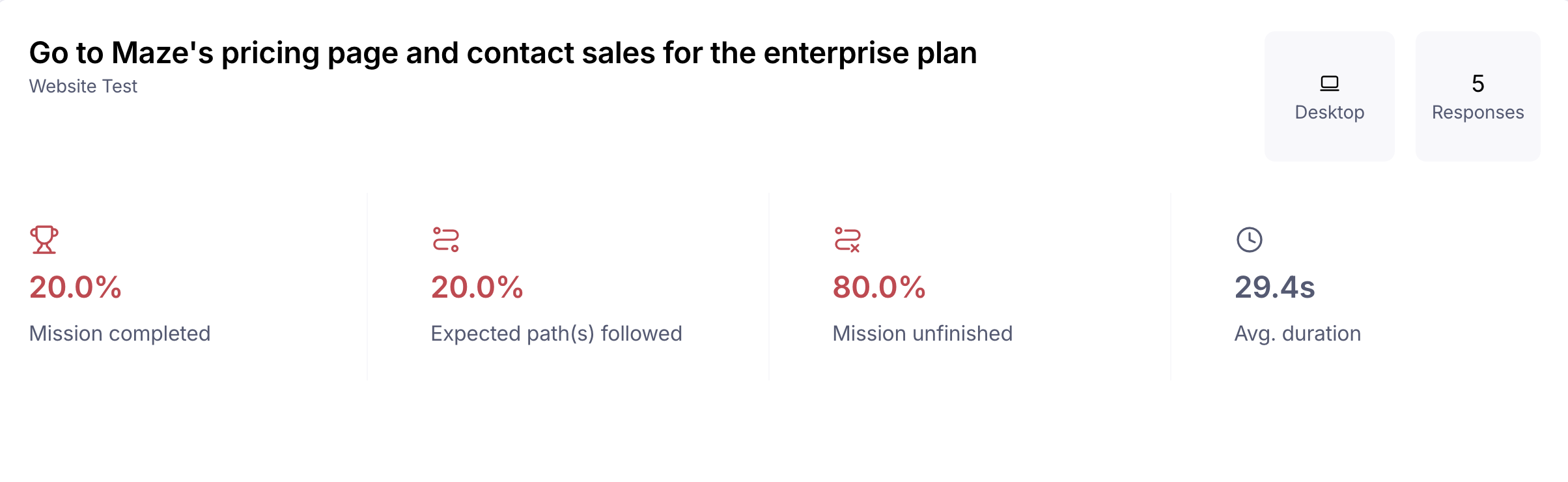
Mission overview
The mission overview highlights the key metrics for the live website test:
Mission completed: This is the total success rate — the percentage of testers who completed the task, both through direct (expected) and indirect (unexpected) paths
Expected path(s) followed: This is the direct success rate — the percentage of testers who completed the task via an expected path
Mission unfinished: Percentage of testers who didn’t complete the task, either because they abandoned it, or because they didn't reach the final screen
Average duration: The average time each tester took to complete the mission
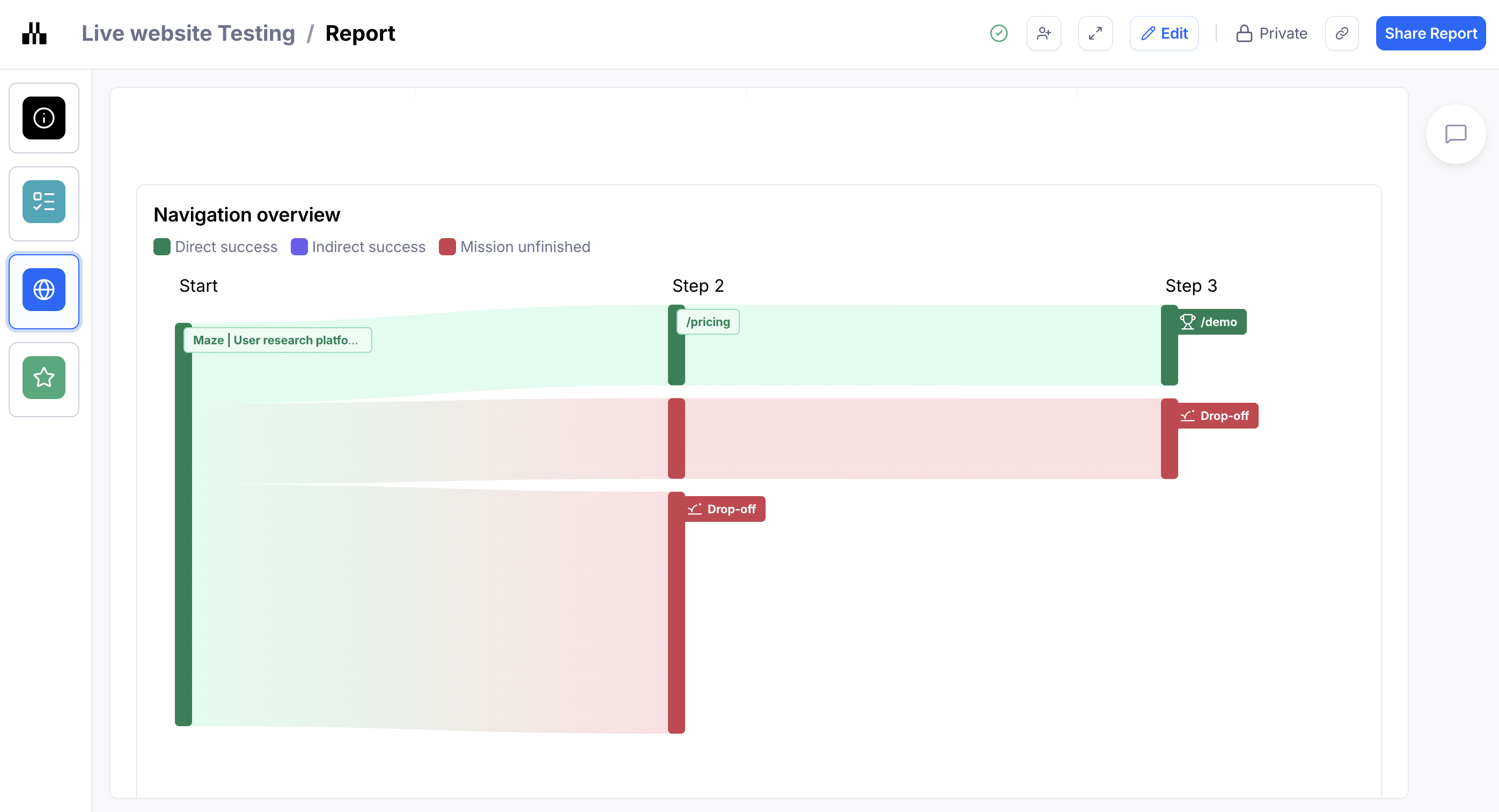
Navigation overview
The navigation overview section breaks down every single path your testers took in your website test, as well as the number of testers and the average time to complete that path.
The Sankey diagram uses proportional bands to show flow relationships with wider bands representing larger quantities. Read from left to right, following how inputs flow into your three outcomes: direct success, indirect success, and mission unfinished.
The relative width of each band instantly reveals the distribution of your results, making it easy to see which outcome category receives the most flow and identify patterns in your success metrics.
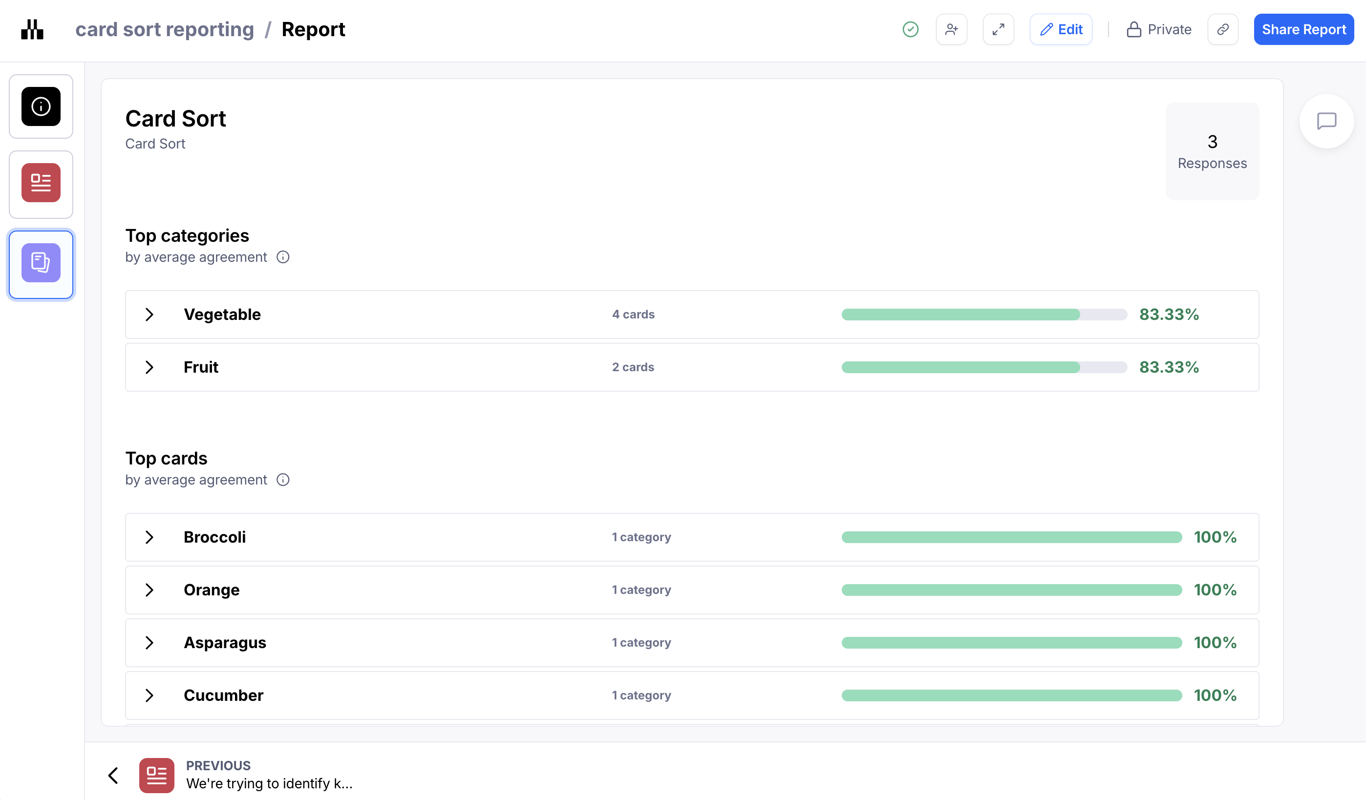
Card sort analysis
Card sorting results are presented in the report as follows:
Top categories: Categories with the highest average agreement rate.
Top cards: Cards with the highest average agreement rate.
Outlier cards: Cards with the lowest average agreement rate.
Unique categories: Highlights the one-off categories created by your testers. This section only appears if you've created an open card sort.
You can also display the agreement matrix and similarity matrix in the report. Learn more
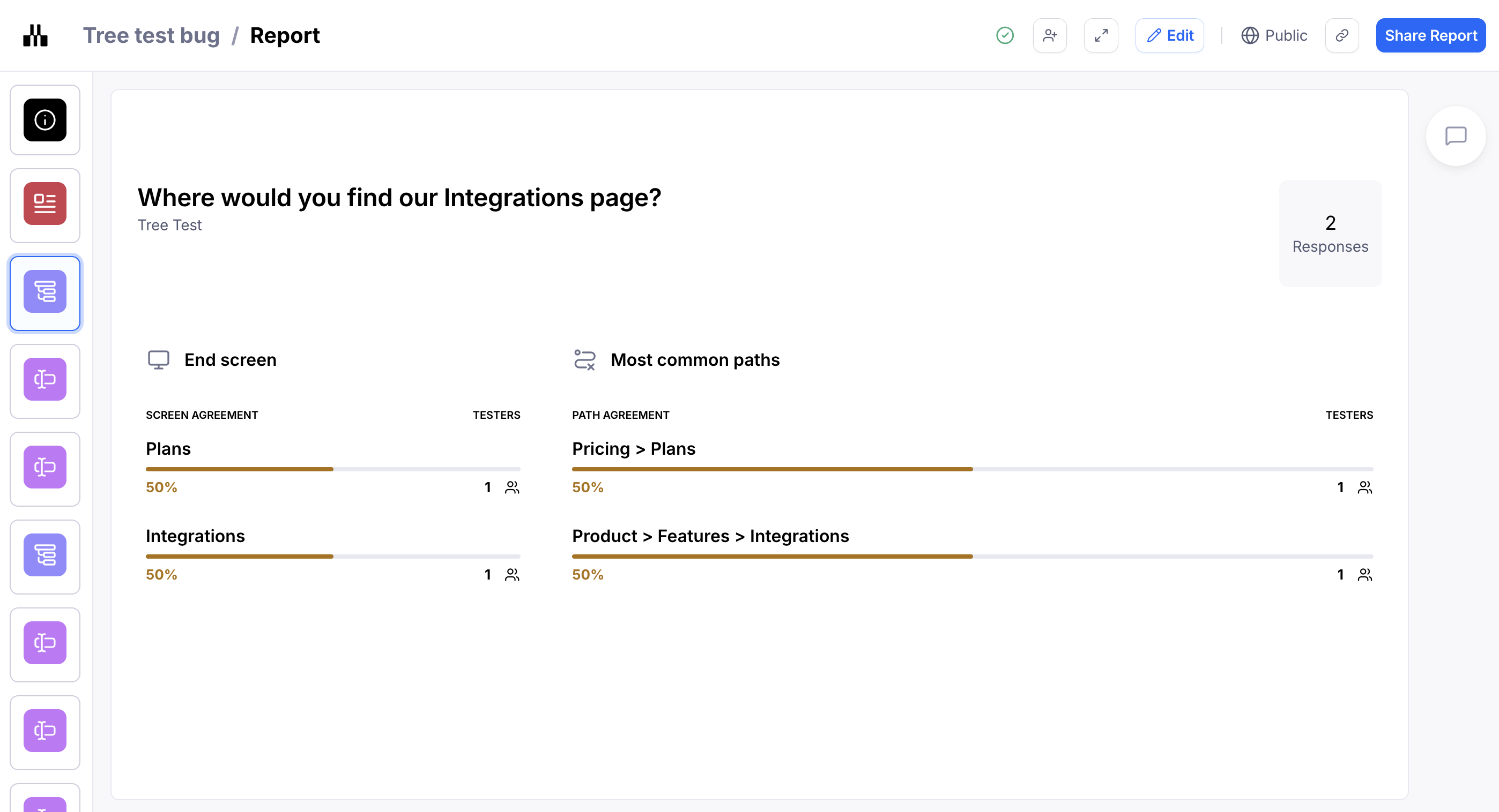
Tree test analysis
When viewing tree test results, you will see:
End screen: The most popular final category selected by testers.
Most common paths: The most common hierarchy selected by testers.
This enables you to see if there's consensus or disagreement over how to categorize/navigate your content.
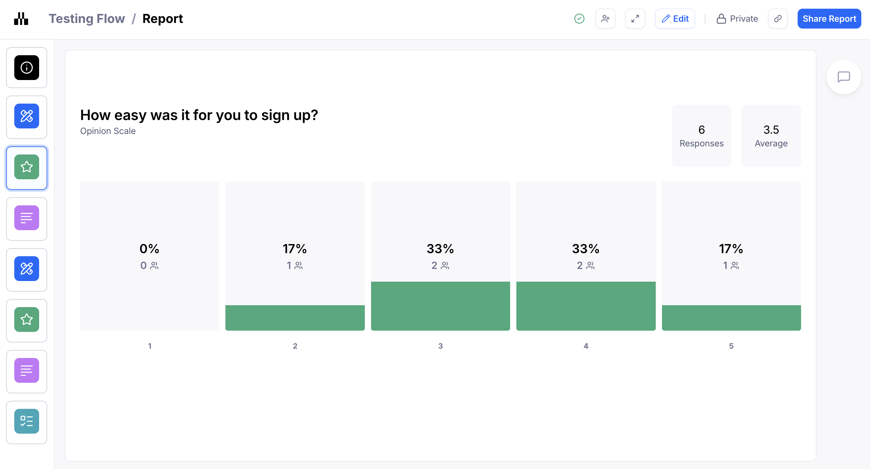
Closed question analysis
For Yes/No, Opinion Scale, and Multiple Choice questions, you will see the visual representation of the results in your report.
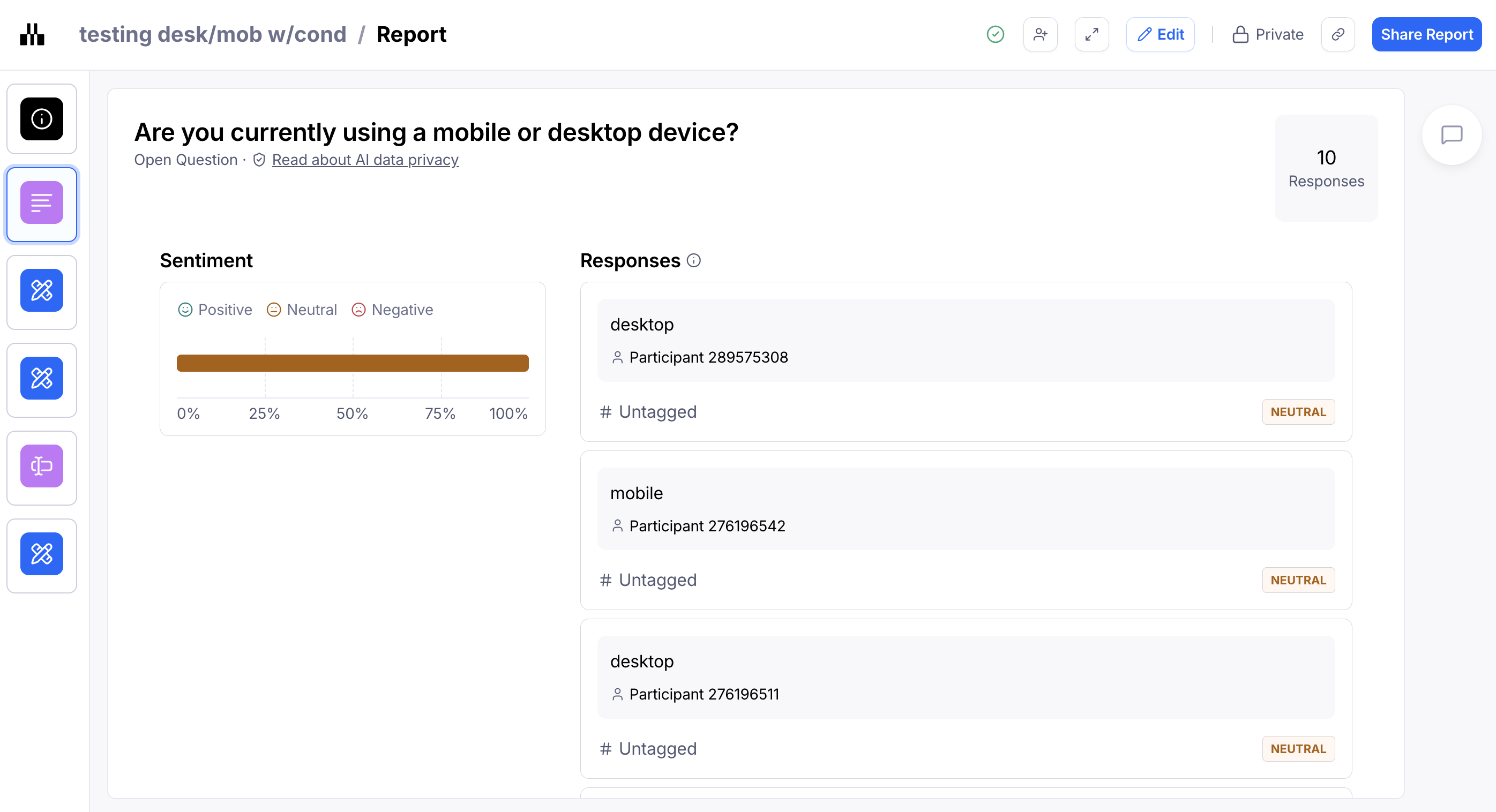
Open question analysis
The report will also show you the answers to your Open Question blocks.
You will see an overall Sentiment rating and you can choose to include or leave out specific quotes from the report. Learn more
Can I edit or customize the report?
You can edit the report to include custom content (e.g. a custom slide) or exclude certain slides.
Learn more about editing your reports
Comments and collaboration in reports
Commenting on reports enables your team to discuss findings, raise questions, explore solutions, and engage with stakeholders throughout the process.
Learn more about commenting on reports
Presentation mode
To present your report in full screen, click Presentation mode.

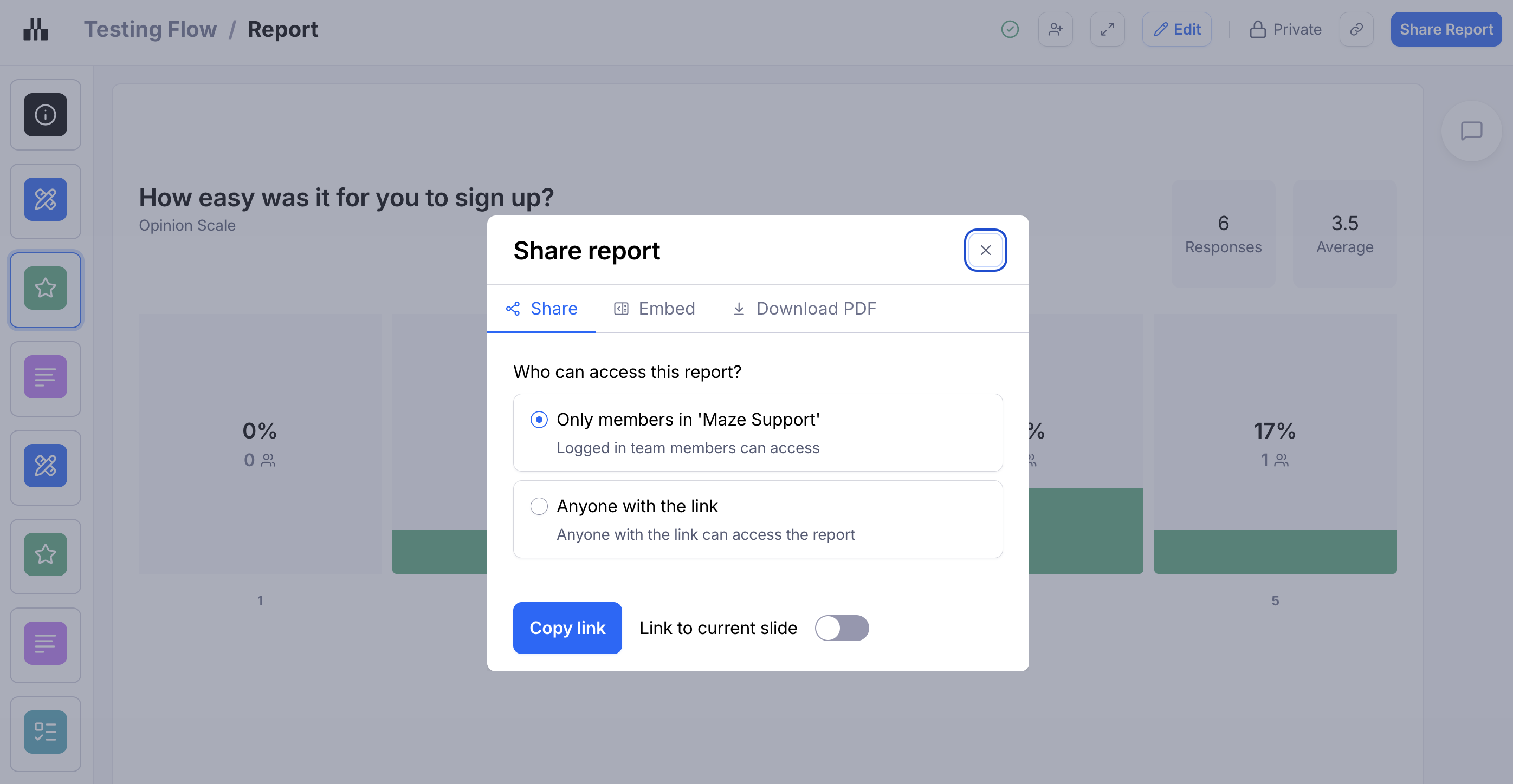
Sharing and exporting the report
Click Share report to copy a link to your report.
Team members on a paid plan can also download a PDF copy of the report for offline viewing.
You can also embed the report directly on some of your favorite tools. Learn more
Learn more about sharing and exporting reports
Still need help?
If you have any questions or concerns, please let our Support team know — we'll be happy to help!